The Bauhaus and colour.
Paul Klee and Kandinsky Houses.
Master teachers of the Bauhaus, Paul Klee and Vladimir Kandinsky were offered houses designed by Walter Gropius as a prototype of a new way of living. Built in the early 1920s, the series of 5 houses (including Gropius’ own house) are set in a pine grove at the edge of Dessau. During our winter visit under the pale light of Saxony-Anhalt and grey frozen grounds, one can see how the red tree trunks and deep green pines offer a welcomed warmth to the houses.


Entering the back-to-back Kandinsky and Klee houses you are immediately struck by a willful collaboration between Gropius and artists in an immersive experience of colour reflecting each of the artists’ own creative universes.

The 1996 UNESCO listing and subsequent conservation schemes that followed have prompted a recurring debate as to the tone of paint to be presented to the public.
On-site investigations of 300 samples revealed that each artist experimented with different colour palettes. The published conservation team colour survey highlights that the two artists worked with similar palettes, yet when visiting the houses their application feels contrastingly different.

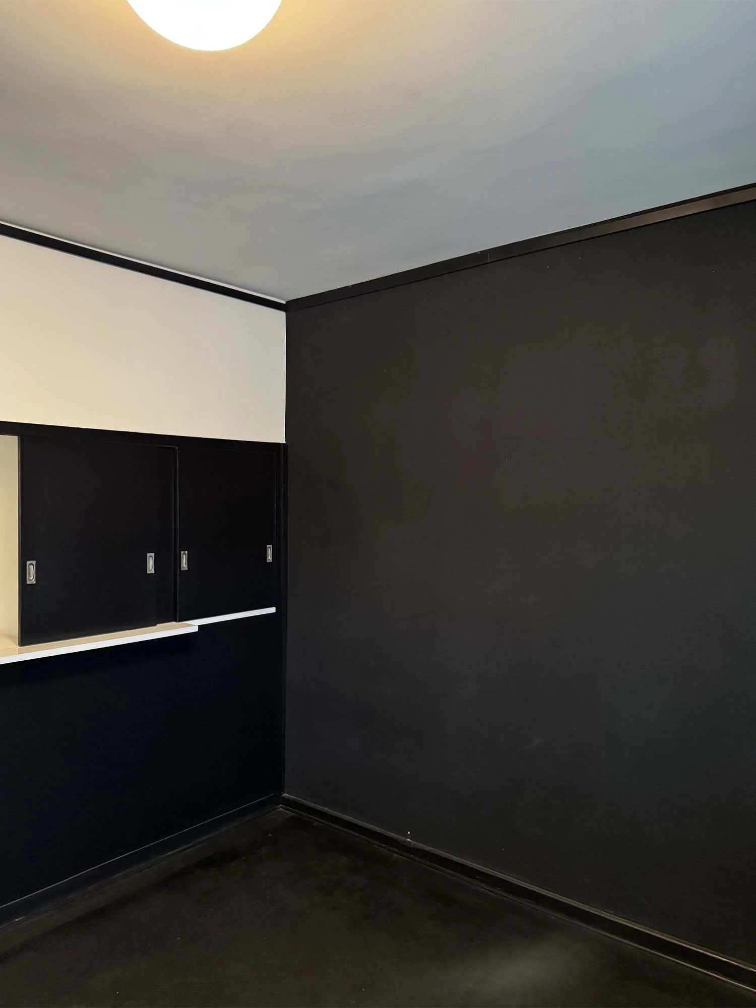
Kandinsky, who led the Bauhaus’ Mural Painting Workshop and was described by his wife as working on the house walls like “a tri-dimensional painting”, makes use of gold and silver tones in his living room to bring a festive layer to the minimal and somewhat compact Gropius design. His exploration of colour includes systemising some colour to some building components such as doors and skirtings in black.
In contrast, Paul Klee’s colour scheme can feel somewhat freer. His distinctive dark red ceiling used in the hallway and floors are bold (apparently to the dislike of his wife). Viewpoints layer colour through multiple rooms.


In visiting the houses there is a wonderful lesson in colour mastery at every turn. Kandinsky’s deep black applied to the tiny dining room feels incredibly audacious and radical to our standards yet provides an effect of intimacy and comfort. Klee’s glossy pastel yellow architraves and window frames shift your perspective to edges and borders, bringing standardised components to the level of a sculpture.


Everywhere experiment and joy abounds…
Scans from “Meisterhaus Kandinsky Klee Die Geschichte einer Instandsetzung” by Philip Kurz